Connect the physical process to the data.
We mapped the paint stages and the questions manufacturing stakeholders needed answered. I translated those needs into a backlog spanning ingestion, forecasting, and dashboard work.
A paint-line analytics workstream connecting material forecasts, manual-versus-robotic comparisons, and operational dashboards.
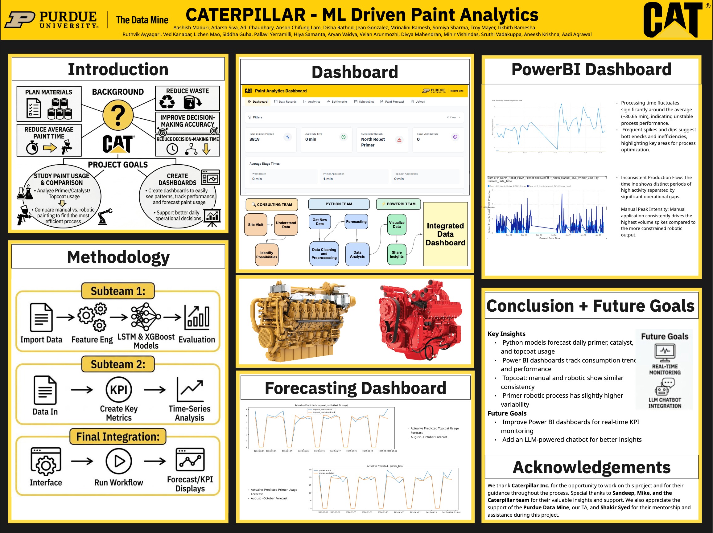
From material inputs and paint stages to forecasting and the dashboard, the project poster shows how the workstreams came together. This is the full team’s presentation artifact.
 Open full-resolution poster
 A paint line uses several materials across manual and robotic stages, but planning and diagnosing waste require seeing the flow as a system. The team needed a way to track paint usage and processing times, compare the two application modes, and forecast material demand in a form operations could inspect.
We mapped the paint stages and the questions manufacturing stakeholders needed answered. I translated those needs into a backlog spanning ingestion, forecasting, and dashboard work.
The Python workstream cleaned and engineered production data, modeled primer, catalyst, and topcoat usage, and compared actual versus forecast material demand. The project deck reports forecast error below 9% WMAPE.
Power BI views examined usage, cycle time, and process variability. I led a nine-person cross-functional Agile team through sprint planning and dependencies while coordinating the data, modeling, and visualization strands.
Explanatory system view · reconstructed from the project
Through Purdue’s corporate partnership, I led a nine-person cross-functional Agile workstream and worked across product planning, data, modeling, and dashboard delivery. The forecasts and visualizations were team outputs, shaped with Caterpillar stakeholders.
The team produced paint-use forecasts and operational dashboards showing consumption trends and manual-versus-robotic process comparisons. The team presentation reports under 9% WMAPE for materials forecasting; it does not establish realized cost or cycle-time savings.
The 20% cycle-time and 10% facility-cost figures were project targets, not measured outcomes. The displayed process and chart are editorial reconstructions; the project poster is a team artifact. Forecast accuracy comes from the team’s presentation and may depend on its evaluation setting.
The problem wasn’t one team. It was the handoff.